
Judging a Book by its Cover
Written by: Beth Woodward, CC2K Books Editor
 We all know the expression: don’t judge a book by its cover. And it’s good advice. After all, I’ve read good books with crappy covers, and I’ve read crappy books with great covers.
But let’s just be realistic: first impressions are important. Even as an e-book shopper, the cover is the first thing I see, what makes me click on a certain book. Then, the blurb and the first 5-15 pages may make the ultimate determination as to whether I buy a book.
So now, I’d like to talk about a few of my own personal preferences and pet peeves of covers, as well as blurbs and openings.
Pet peeve #1: Cover models that don’t look like the characters.
I visualize books like a movie playing in my head. My first impression of what the character looks like comes from the cover model (if there is one), and it’s jarring when the cover model doesn’t match the description given in the book. Recently, I read a book where the cover model was very exotic looking: dark haired, maybe of Asian ancestry. Unfortunately, the protagonist was described as an all-American looking blond.
It bugs me not only because I wind up forming an inaccurate picture of the characters that’s hard to get rid of, but also because it would be so easy to fix. I’m not sure what the justification is, but it happens more frequently than you’d think.
Pet peeve #2: Generic-looking covers.
There has been a tendency in the book industry to sell books of a certain genre by making them all look alike. Take the romance novel, for example. How many times have you seen romance novel covers featuring shirtless men with rippled pectorals and long, wind-blown hair? Or the urban fantasy covers with a half-naked, leather-clad heroine carrying a sword?
I understand that these similarities “brand” books as part of a certain genre. But honestly, I pick up books because they look different than everything else out there, not because they look the same. The covers that tend to catch my eye are interesting and unique.
Pet peeve #3: Blurbs that don’t say anything.
Everyone likes a little bit of mystery…but not in a book blurb. If I’m going to pick up a book by an author I’ve never read before, I have to know what the book is about first. Telling me that the author is “The next Dean Koontz” or that “Stephen King fans will rejoice” doesn’t really tell me anything. Even blurbs from popular authors can be misleading; just because I like Charlaine Harris’s work doesn’t mean I’ll like every book she likes. Who is doing what to whom? That’s what I want to know.
An author with an established brand and name recognition value can get away with this…but it still irritates me. A newer or less established author…not so much.
Pet peeve #4: Blurbs that give away the whole shebang.
Sometimes it’s easier to explain things with examples, so how ‘bout this one: pretend for a moment that it’s 1980. You’re going to the movie theater to watch The Empire Strikes Back, but first, you see a summary in the newspaper that reads something like this (and, uh, spoiler warning for anyone who’s been living under a rock for the last 30 years):
After being attacked by the Empire on the ice world of Hoth, Luke receives a vision from Obi-Wan telling him to go to Dagobah to study with the Jedi master, Yoda. Meanwhile, Leia and Han retreat to the Cloud City, where Han’s friend, Lando Calrissian, allows them to hide out. When Luke realizes that the Cloud City has been invaded by the Empire and Leia and Han captured, he attempts to rescue them, only to confront Darth Vader again and find out the horrible truth: that Darth Vader is his father.

Yeah. That would have sucked. Unfortunately, a lot of book blurbs I read seem to forget this.
But I’m all about the positive reinforcement. So let’s talk about a few covers that I’ve really, really liked recently.
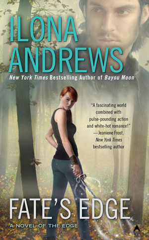
Fate’s Edge by Ilona Andrews. This book isn’t scheduled to be released until September, but the cover was posted on Andrews’ site recently. I love it. I love that the heroine looks like an everyday girl, with just a touch of badass. I love that, even though this is a romance, there’s no naked man pectorals on the cover. (Not that I object to naked man pectorals in theory, but they get tiring after awhile). It caught my eye immediately.
Clockwork Angel by Cassandra Clare. Steampunk is all the rage right now, and one of the awesome things about combining sci-fi, fantasy, and alternative history is that it gives cover artists the opportunity to design really cool, imaginative covers. This is one of my favorites. I love the colors, the use of light and dark, the London skyline in the background. It caught my eye long before I read the book.

Halo by Alexandra Adornetto. I’ve heard mixed things about this book, but this cover blows me away. Love the silhouettes, the sunset, the light on dark.
Blood Rights by Kristen Painter. When I saw the beautiful gold filigree on the cover, the black and white with just hints of red, I was immediately hooked. Is the book any good? I have no idea: the book isn’t scheduled to come out September 27. But with this beautiful cover, combined with an interesting blurb, and you know I’ll be there on release day!